Monday, June 29, 2009
Lavender Get Well and Blog Candy Winner!
Marie B. said...
Wow! Hello Robin! I came here by way of Jenny's blog, and I really love these stamps! How cool are they?!? Love the colors you chose to work with on your card...this is the first time I have heard of Repeat Impressions too, and I wonder why??? Must check it out! :) Happy blogaversary too!
June 23, 2009 8:44 PM
Congratulations, Marie! Please send me an email (RobinKirk@aol.com) with your selection and contact information!
OK, on to today's card! I recently needed a get well card for a good friend who had surgery and loves lavender. This Lockhart Stamp Company image fit the bill perfectly! Once I had selected the image, I decided to use this sketch from the Clean & Simple blog as my starting point. The patterned paper is from the Memory Box Biscotti collection and the card stock is from the Prism Majestic Purple Pack. I stamped the image on Rustic White card stock and colored it with Copic markers. I used a larger square Nestabilities die to draw the outline with a Lavender Copic Spica pen. The Feel Better sentiment is from Papertrey Ink's Mixed Messages set and was stamped using Adirondack Eggplant ink. That's about it for this clean and simple card!
Thanks to everyone who left such nice comments for the blog candy giveaway. I really appreciate all your kind words! Have a great week and try to keep cool!
Friday, June 26, 2009
Friday Three-Fer
On to the details of my three-fer card:
1. Use the Repeat Impressions quartet stamp - check!
2. Sharon's challenge - use Grass Green and Sky Blue AND paper piercing - check! You can't see the piercing too well in the photo, but I pierced little triangles in all four corners of the patterned paper background and all around the black mat under the quartet image.
3. Flourishes Friday - use a solid stamp - check!
I stamped the Quartet image using Versamark on glossy card stock, then heat embossed it using clear embossing powder. Next, I masked each segment of the stamp and sponged Stampin' UP!'s Baja Breeze and Ranger's Peeled Paint Distress Ink in opposite corners. The patterned papers are from BasicGrey's Urban Prairie 6x6 paper pack and the ribbon is Baja Breeze striped grosgrain. My cute little bow was made using the Bow Easy, which you can get from Sharon's store.
If you haven't done so already, please sign up for a chance to win an unmounted sheet of four of these quartet stamps by leaving a comment on my blogoversary post from Tuesday. And check back Monday morning when I'll be announcing the winner!
Have a great weekend!
Thursday, June 25, 2009
Thinking of .... cooler weather!
I started out by determining the right size oval Nestabilities die for my frame, then I colored directly on my stamp using Stampin UP! markers in Handsome Hunter, Chocolate Chip and Really Rust. After I stamped the image on the card, I taped my die to the card front, put a layer of scrap card stock on top of it, folded the back of the card on top, crossed my fingers and ran it through my Wizard with just the rubber embossing mat. It always makes me a little nervous doing this on a one layer card, for fear my die will move or I'll get unwanted indentations on the card (which is why I add the layer of scrap card stock), but it worked! Once I had that done, I used my white opaque pen to add a little frostiness to the pine needles and branch, and I used my Atyou Spica pens to add some shimmer to the pine needles and the chickadee's eye.
Next, I added some Papertrey Ink Rustic Jute Button twine to my Rustic Wood buttons, frayed the ends of the twine and adhered them in the corners with glue dots. Finally, I stamped the sentiment in the lower left corner, using a stamp positioner.
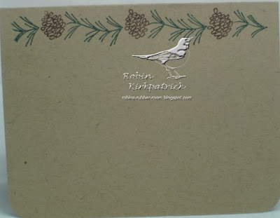
To keep the 'green' theme going, I also inked up this pine cone border (1506-M) stamp with the Handsome Hunter and Chocolate Chip markers and stamped it at the top on the inside of the card.
This was a quick, easy card to make, and it's helping me think of cooler weather - we're having some HOT temperatures here in Atlanta this week!
Finally, if you haven't already done so, please register for my blog candy giveaway by leaving a comment below on Tuesday's post. I'll be announcing the winner Monday morning. If you're going to be in the Orlando area this weekend, stop by the Repeat Impressions booth at Stampfest Orlando, say hi to Wendy and check out all their great stamps!
Have a great day and thanks for looking!
Wednesday, June 24, 2009
Belli Challenge - Patriotic Card
I added some gold beads to the corners of the main image, the corners of the largest panel and one on the center of the largest star. That's about it!
Don't forget to sign up for my blog candy if you haven't already done so. Just leave a comment on this card to be eligible to win a sheet of four of Repeat Impressions' new Quartets stamps. I'll announce the winner here on Monday morning.
Enjoy your day! Thanks for looking.
Tuesday, June 23, 2009
Happy Blogoversary to me, Blog Candy, AND an announcement!
Today's card was made using a new stamp from Repeat Impressions. Wendy has come out with a new series of stamps called Quartets. These stamps offer a lot of versatility as they are 4"x4" square and divided into four equal sections. For this card, I chose to go with a semi-monochromatic color scheme and stamped the butterfly quartet using VersaColor Celadon ink, to match my background.
I stamped the quartet twice on Papertrey Ink Rustic White card stock, inked all the edges, cut out the upper left and lower right quadrants and popped them up on foam tape. For the butterfly in the upper left corner of the quartet, I went over the stamped image with a Copic Spica glitter pen to give it a little more definition and some shimmer. In the upper right quadrant, I cut out one of the butterflies from my second stamping, using a Martha Stewart butterfly punch, and adhered it with a glue strip just in the center of its body so I could pop up its wings. I added three clear rhinestones for the body.
The card base is a black textured card stock base, with a layer of Hambly patterned paper and a Hambly screen print on top. The ribbon is May Arts silk ribbon that I colored with a Copic marker. The butterfly charm is from Pixie Press and the flowers are from my stash.
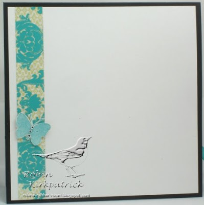
For the inside of the card, I repeated the layers of patterned paper and screen print, and added another butterfly on top:
Hope you enjoy this quartet card and can imagine the possibilities it offers. To see samples of cards using some of the other quartet stamps that are available (there are 12 in all), please be sure to check out these cards made by my fellow Repeat Impressions design team members, Jenny Gropp and Sandy Hulsart.
AND, I have another big piece of news to share today - I have been asked to be a member of the Creative Belli Challenge Design Team. I'm very excited to participate in the bi-weekly challenges put on by the Creative Belli team, so please check back regularly to see what challenges are brewing!
OK, FINALLY, on to the blog candy.... Wendy at Repeat Impressions is graciously offering an unmounted sheet of quartet stamps for my blogoversary candy! That means you will win not one, not two, not three, but FOUR quartet stamps! A quartet of quartets!
Here are three different sheets you will be able to select from if you are the winner:
Plate 8500b
Plate 8500c
To win the blog candy, leave a comment on THIS post before midnight (EST) on Sunday, June 28. I will select a winner at random and announce the winner on Monday morning, June 29.
Monday, June 22, 2009
Flourishes Timeless Tuesday Inspiration Challenge
Later, when I went to post the card for the challenge, I discovered the whole 'Kimberly Poloson' thing....so I started over! Back to Allposters.com to search again. This time I found this poster - Bel Bouquet I - that I thought would be great using the Sweet Peas set. So off I went to make this second card!
For the first card, the patterned paper is from Frances Meyer, the card stock is Papertrey Ink Kraft and Rustic White, and Prismatics Island Mist. Stamps are all from Flourishes (Birds and vine, and Thank you, and Ornamental Elements). The tulips were colored with Copic markers, cut out and popped up with foam tape. The flower images from Birds and Vines were stamped in the upper left and bottom left corners of the patterned paper and the main flourish from Ornamental Elements was stamped on the rustic white card stock behind the tulips. The ribbon is May Arts taupe silk from Sharon's Ribbon Store.
For the second card, the card stock is Papertrey Ink's Rustic Cream and Stampin' UP!'s Bravo Burgundy. I used a variety of stamps on this one - the backgrounds are Linen from Stampin UP! and Le London Script from Stampendous. The flowers are from Flourishes Sweet Peas set and were colored with Copic markers. The sentiment is from Flourishes' Flourished Words set. The ribbon is May Arts ivory silk that I colored with Antique Linen Distress Ink to match the card. The copper pearls are from Kaisercraft.
Hope you had a nice weekend! Please be sure to check back tomorrow for a chance to win some blog candy!
Wednesday, June 17, 2009
Strawberry thank you
The card base is Papertrey Ink's Kraft card stock with a layer of their Vintage Cream on top. The patterned paper is from Provocraft Pathways Romance Pad and is matted with Stampin' UP's Always Artichoke. The main image is matted with Riding Hood Red in addition to the Always Artichoke. The Riding Hood Red layer was cut using a Scalloped Rectangle Nestabilities die. The square green brads are from Bazzill and the ribbon is from the Paper Source.
Not a lot to it, but I liked the way it turned out and it came together pretty quickly - start to finish it was about an hour. That's the closest I'll ever get to a ten-minute card!
Hope you're having a good week. Thanks for looking!
Don't forget to check back next week for a chance to win some blog candy!
Monday, June 15, 2009
Never give up!
A few weeks ago, Ellen Hutson posted a tutorial in The Classroom about a technique called ghosting and I thought I would give it a try. The technique involves stamping with white pigment ink, then inking over it to accentuate the stamped image. The white stamped image will resist the ink, leaving a ghost-like effect. I used a wood grain background stamp from Cornish Heritage Farms, stamped with Ranger Snow Cap Pigment ink on a regular shipping tag. I sponged some Ranger Distress Ink in Antique Linen, Vintage Photo and Weathered Wood around the tag to accentuate the wood grain.
Once my tag was complete, I stamped the fly fisherman and sentiment, also from Cornish Heritage Farms, in Memento Rich Cocoa ink. Both were cut out using Nestabilities dies (I cut out the fishing line section first, and slid the die under it in order to keep it from being cut by the die) and sponged with the Distress Inks while still in the die. I assembled the card using the Card Architecture Blue Print #1 sketch that Ellen provided in the Ghosting post.
My background paper is a wood grain pattern from Basic Grey's Granola collection. On top of that, I layered my ghosted tag, then a couple of strips of blue papers, also from Granola, then my main image and the sentiment. The sentiment was topped off with a couple of Papertrey Ink's Rustic Wood buttons and twine. The end result is a nice masculine card.
Next week is my one year anniversary of blogging and I'll be giving away some goodies to celebrate, so be sure to check back!
Thanks for looking and have a great week!
Wednesday, June 10, 2009
Belli Challenge - Happy Father's Day
I used Gina K. Design's King of the Grill stamp set and paper pieced the golf bag with Stampin' UP's Manchester patterned paper collection. The sky and grass were airbrushed with Copic markers. I stamped the golf clubs twice and cut them out, then cut a slit across the top of the golf bag and slid them in. I modified some white brads to make them look like golf balls by adding some light gray 'dimples' using my Copic markers.
For the inside of the card, I layered a matted strip of the patterned paper and added another set of golf clubs on top of that.
Hope you're having a great week! Thanks for looking!
Friday, June 5, 2009
Fly
I made this card for the Color Throwdown (the colors were Stampin' UP!'s Bordering Blue, Elegant Eggplant and Barely Banana) from last Wednesday, but didn't get it posted in time to participate. I also used the sketch from last Friday's Cupcake Challenge (TECC70), and now that they run through Friday, I'm just squeaking this in on time for that!
The sentiment stamp, the 'fly' stamp and the butterfly corner flourish are from The Angel Company and the butterfly trail is from Hero Arts. The butterflies were punched using two different Martha Stewart punches and gemstones were added to each for their bodies. The ribbon is from Martha Stewart, too. The patterned papers are from the Memory Box Poppyfinch collection and the card stocks are the three Stampin' UP! colors from the color throwdown challenge.
Hope your week is going better than mine! I did have the opportunity to go see the Jersey Boys show this week and it was terrific. If you have the chance to see it, I highly recommend it.
Have a great weekend and thanks for looking!
Tuesday, June 2, 2009
Better late than never...
This underwater scene is a single stamp from Sarasota Stamps that I colored with Copic markers while it was still in the Curved Rectangles die, to get the white border. I added some sparkle to most of the elements in the scene using Spica pens. The turquoise card stock was folded in half and cut using the largest Curved Rectangles die to create the card base.
For the inside of the card, I used the smaller curved rectangles dies to cut the sentiment panel and its mat. The mat paper was made using a background stamp from Stamp Camp and the sentiment is from Coronado Island Stamps.
Thanks for looking!